The experience of a user depends on what he/she sees.
Have you too spent countless hours playing that little color picker just brute forcing every color combination possible for your website. Well there's actually a technical solution that exists to solve that problem, which is also used in many industries considering their captivating themes.
What a color actually conveys.
White - Pure, Simple, Clean, Open
Black - Mystery, Technical
Dark Blue - Elegance, Professionalism, Reliability
Orange - Modern, Energy, Creativity
Red - Passion, intensity, Dynamism
Green - Growth, Balance, Finance
Yellow - Joy, Optimism, Happiness,
Beige - Soft, Warm, Home
How to choose type of color shade.
There are popularly 2 types of color schemes used nowadays - MATTE and VIBRANT
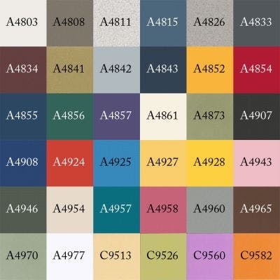
MATTE - If your website is more technical and have domains like Finance, Sports, Business, etc, you may prefer matte color shades. Matte shades are the ones that are not too bright, soft and more on the dark side of the palette.
This palette shows a good range of matte colors (By Meghan Prendergast on pinterest)

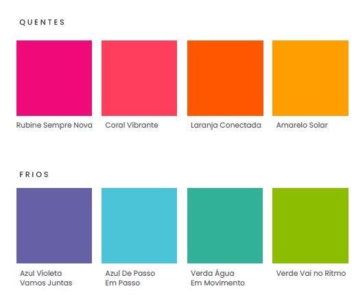
VIBRANT - If your website is holding domains like Fashion, Lifestyle, Travel, etc you may prefer vibrant theme color palette. It represents a joy and enthusiasm among users, just perfect for the domains falling into this category.
Example - (By Maris P on pinterest)

Choosing primary and secondary colors.
The primary and secondary shades that you choose for your website serves a lot in your appearance among your users.
The simple trick for choosing either is -
Primary Colors - Should be warm and deep colors instead of joyful colors like green, orange, etc. The objective of primary colors is just to form a foundation for your secondary colors.
Secondary Colors - Should be a contrast, that is exactly opposite to your primary ones. It should not happen that the secondary and primary mixes up, making user's visibility minimum. They should appear at much more height Z-axis in front of your background.
Additional contrast colors - You can add more additional colors that are not exactly opposite to secondary colors, but within a shade of them.
You can prefer any color wheel, and pick
Primary - Soft, Non Vibrant
Secondary - Opposite to primary colors on the wheel
Additional - Within vicinity of secondary colors
For example this is an excellent demonstration of how 3 colors - Primary (#EEF2F8), Secondary (#E0731C) and Additional (#4C90E7) colors by Goibibo.com

Conclusion
Your palette should be uniform and not like hundreds of colors dispersed at countless places.
There is an amazing extension in Firefox just right for working with your design colors. http://www.colorzilla.com/